Design is in the Details

02.23.2010

Often, I think it’s much easier to find that signature piece of furniture, or that just right seating arrangement, than it is to find the touches that really pull the room together into a space in which you’d like to spend time. Which is maybe why my own walls sat bare for over a year….However, it’s the stuff – the art on the walls, the collection of family photographs, the right number of accessories (more than none, less than cluttered!) – that really finish a room. Ideally you can take your time, and wait for inspiration to strike. Usually though, a client isn’t going to wait for a year for you to think of that perfect piece – they want it now! To that end, I’ve been compiling a bunch of ideas, focusing on wall installations – if I gather enough quantity, I know that the right décor will appear. I’ve been noticing a bit of a theme out there that I like – vertical panels in groups of three. Here are some of those I’ve come across!

Source unknown

Target

Target

Some very poor screenshots from my computer from Inhabitliving.com

http://www.inhabitliving.com/detail.aspx?ID=1179

I know the photo collage wall and decals are really popular out there currently, and while I like them in certain situations, I just don’t think it’s right for the space we are considering right now….

Where do you look for wall inspiration? What are you drawn to right now?

-Kim


Trend Alert – Chevron

01.08.2010

So, according to Pantone, the color of 2010 is turquoise.

And according to my Google blog reader…the PATTERN of the year is the chevron!  In the past month, I’ve seen various incarnations of the chevron trend on no less than FIVE pretty influential blogs.

First up was the ubiquitous dooce with the affordably priced Chevron Tea Towel from Ikea.

Then I saw it on one of my new favorites, Young House Love on fabric.

Nicole of Making it Lovely likes it in a rug.

The lovely Holly Becker of Decor8 shared a DIY chevron wall hanging.

Then Design*Sponge took it a step further with my personal favorite of the bunch so far, the full chevron wall.  You could double up your trendiness by creating this in shades of turquoise!  It’s affordable and easily changeable since it’s contact paper!  Because when you’re being trendy, it’s often nice to swap it for the next big thing without a big fuss.

What do you think of the trend?

-Kim


Message Station

01.06.2010

Looks like it’s DIY week here at EFeDesigns!  Or, it’s talk-about-something-you-DIY’ed-in-the-past-3-months week…..anyway, I often found the side of my fridge to be a bit…cluttered.  See, it’s shoved into a corner, and, oddly, the front is not magnetic.  (Whether this means we got cheated and our appliance is stainless plastic, or that my stainless steel was meant to stay pristine and shiny, I’m not sure.)  Thanks to the adjacent cupboards, there is not a lot of real estate to pin up things like invitations, reminders, cute pictures, or a message board like I am accustomed to having in my kitchen.This picture is quite old, obviously taken before we’d fully moved into the kitchen, but you see the dilemma.

I’m a habitual cork-saver.  I think that lots of wine bottle corks are actually quite lovely, and it’s a shame to toss them.  So I got into the habit over the past several years of tossing them in the drawer with the corkscrew, and then filling up jars when the drawer got too full….and where am I going with this you might ask?  Well, rather than being surrounded by jars of wine corks and looking like some crazy wine-o, I thought it would be cool to make a cork-corkboard with them.  I also thought that if I was creating a display area, an adjacent message board would be nice as well, but I definitely wanted them to go together.

I hit my local Michael’s craft store, where I found in their unfinished wood area a frame with some depth.  I think it’s meant to be a shadow box or something, but it worked perfectly for me, as I needed something with a deep frame to hold the corks, as well as a ledge for the chalk and eraser to live on for my chalkboard message board.  I think I spent something like $15 for two.

I planned to paint the frame and inner edge white to match my trim, but realized that perfectly masking off the inside corner while I spray painted chalkboard paint (or conversely getting in that corner with white paint post-chalkboard paint) would be a pain.  Instead, I opted to paint the inside frames of both boxes with the chalkboard paint – it’s key to have a very well ventilated area for this.  I used my driveway, after hearing about Sara nearly asphixiating herself in her basement.  After a bit of dry time, I primed and painted the frames and back boxes, and set to work attaching my corks.

I was disappointed to find that they were not the absolute perfect dimension all the way across, so I did a fair bit of trimming with an exacto knife.  For adhesive I used some Mod Podge I found in my basment, so here’s hoping it holds up to push pin removal.  If not, it will be easy enough to reattach with something stronger.

After a final trip to Home Depot to get some photo hanging hooks, as my cheapo frames came with no way to attach to the wall, my message center is complete for now!

Disregard the unpainted hall to the back stairs on the right.  (Isn’t every home a work in progress?)

Those very attractive people are our good friends Liz and Paul.

That cutie little monster baby is my husband’s godson Mason.

The chalkboard paint inner edge.

Detail of chalk ledge and hangers.  These were key for me in case I want to take these down for any reason and easily re-hang.

As a bonus – the depth isn’t so great that they protrude past the adjacent door frame, so hopefully no one will walk into them.

-Kim


Idea House

11.04.2009

While paging through the November edition of Coastal Living, I found myself entranced by photos of their 2009 Idea House. I stared at each page, studying all the details and enjoying the overall effect created by each room.

I like when a space makes me stop and dream about using similar elements in my own home. Whether it be the color of a wall, the shape of a lamp, or the way different eras are brought together in one space using different pieces, I like when something makes me stop and think, reflecting over what exactly it is about the space that is drawing me in.

In the Idea House, each room was a new delight to study (minus a couple of rooms, which are not pictured here).

Living Room

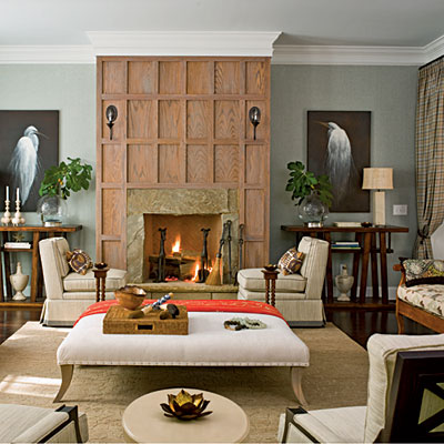
I’m drawn to soft, subtle colors. I can’t pick just one favorite thing from this room—I love it all. The walls are such a beautiful color and look fantastic with the limed oak fireplace and the dark, moody artwork.

Dining Room

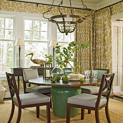
While I’m not wild about the teapot pattern of the wallcovering & drapes, I do like the idea of using the same fabric for a wallcovering and for drapes.  And using a giant pot for a table base—great idea!

Kitchen

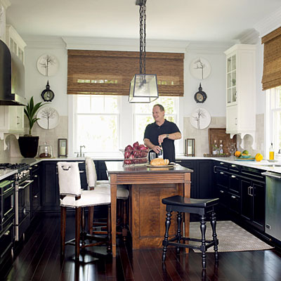
I love two things about this kitchen. One: the black cabinetry—so beautiful. Two: the use of different materials on the island. I can’t wait until my husband & I have a larger house and can use this technique in our own kitchen. I like that it makes a kitchen feel unique and not like it was picked out of a catalog.

Screened Porch

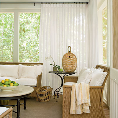
The drapery. Full-height drapery will always hold a special place in my heart. It’s so elegant and luxurious. One way to add instant drama to a space.

Bedroom 1

Bedroom 2

Bedroom 3

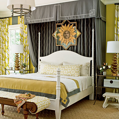
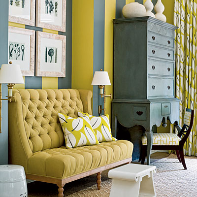
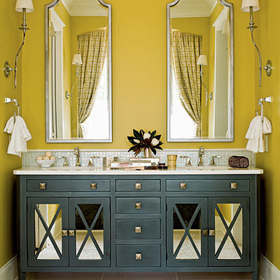
Speaking of drama, that’s exactly what this master bedroom is: dramatic. I am a huge fan of using grey as the neutral in a space (rather than white or off-white). Paired here with a bright chartreuse, it’s simply stunning.

Guest bed 1

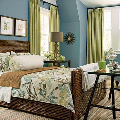
Another favorite color combination of mine: blue & green. Peaceful, bucolic, relaxing.

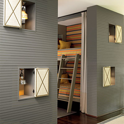
Bunks

This space is one of my favorites. I like the idea of using every niche in a house to its fullest, so when I saw these vibrantly colored bunk beds tucked away behind the horizontal grey bead board walls…I wished I were a kid again.